Lousy Ad: Why You Shouldn’t Simply Convert Coloured Ad into Black-White Ad?
When you want to publish an advertisement with black background and white text, be extra careful. You might end up like the ad shown above.
I do not know if this is a case of a penny-wise, pound foolish client or an honest mistake by the designer who does not have enough understanding of press production.
There are just too many clients out there who happily get their ad agency or creative firm to do up an array of full colour brochure, hand bills, poster, wobbler and yes, advertisements. When it is time to run a black-white advertisements in the dailies, they happily tell the art director, “Use back the same artwork”. Some give that instruction because the boss had already approved the colour ad and it is much more convenient just to re-use and recycle in the spirit of harmonious co-existence. Yet there are some whose intention is to save money on artwork adaptation or re-work. And, of course, there are clueless clients who did not understand the devastating effects of simply converting a colour ads into black & white ad without looking into production concerns.
What are the flaws of simply converting a colour ad into black and white?
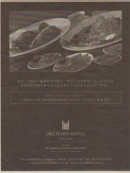
1. Photographs that are taken in colour may not look good in mono-chrome.
It can be a combination of contributing factors, like focus point, lighting, exposure, sharpness, positioning, angle, background colour, nature of subject, etc. For the above ad, the hotel’s objective is to show a variety of Chinese New Year’s favourites. Yet, as a Chinese who eats Chinese food almost daily, I cannot decipher what were shown. I saw two big lumps on the left plate and seemingly mushrooms on the right plate. I recognized a lonely lime on the smaller plates, and that’s about it. When I cannot see the yummy cuisines in their full glory, I have no motivation to put the hotel on my consideration list. What a waste.
If that is the only photo you have and you absolutely must use it, get your designer to do some colour adjustment. It is an investment. Otherwise, you are just throwing good money away.
2. Text can be tough to read.
Coloured text on white or light background, or coloured text on contrasting background are aesthetically attractive to the eyes. It is easy to read the text – even small text in 6 -7 pointers. Sometimes, words can literally jump out of the page by using the right mix of font, font size, colours and positioning. In this case, it is a real sorry state because you have to squint your eyes to read Chinese characters slowly to understand. Click on the advertisement to expand to approximately 12cm width by 15cm height, and you will note that the key line of the box and some Chinese characters appeared to be “broken”. How did this happen? Firstly, the chosen font is a skinny-style. Secondly, the black ink, when printed on the highly ink absorbent newsprint paper, tends to bleed into the thin white areas. In a nutshell, when you choose to use white text on black background, make sure your font and font size are correct. Of course, check the dpi of the media used.
Personally, I will not recommend white text on black ground unless very few words are used, and these few words can be easily read. Researchers have done enough studies to advise these:
- Inverted text is proven to decrease readership by as much as 50%.
- Inverted text is exactly opposite from the format of text people are used to reading (black-on-white).
- Readers cannot easily focus on any one piece of text for a long period of time.
The above advice is good whether the medium is offline or online.
Overall, this ad is dark and gloomy which is against the spirit of Chinese New Year which symbolizes the coming of spring where everything is growing, blooming and prospering. This ad reminds me of Gotham City.
Still, I appreciate the learnings I got from this ad. I kept this ad in my file for the last 2 years so that it serves as a constant reminder. Eleanor Roosevelt had this to say, “Learn from the mistakes of others. You can’t live long enough to make them all yourself.”
3 Replies to “Lousy Ad: Why You Shouldn’t Simply Convert Coloured Ad into Black-White Ad?”
I like this Blog
B&W , yes while it has its own built in message and romance attached with it, some use and most of them misuse this!!!
You are right, esp when you look at the technical side of the same while finally it comes into a print medium.
We in films, esp ad films, use this to show “period” of “seasons” or number of years a corporate has been there in the market place, and then comes alive with color.
Using B&W is an art and science by itself, and could be effectively used if the Creative team can justify the tone.
Regards
Ravi Shivram
CEO
Energyworks
BLOG http://slogansmith.blogspot.com
Yes, Ravi, you are right that black and white advertising is an art of itself.